Google's Got A Brand New Look
Silicon Valley has pretty much come to life, people.
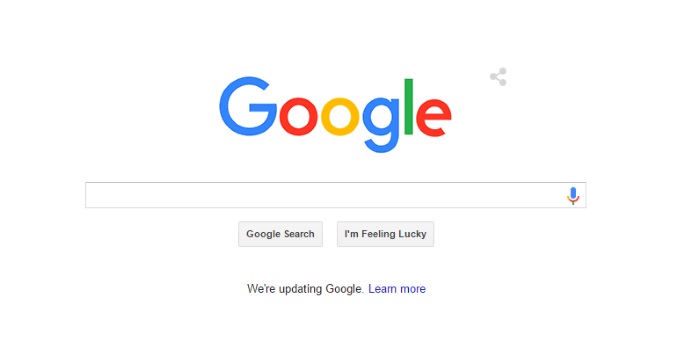
If you visited Google this morning – as you likely were, driven by Pavlovian impulses – you would have noticed an animatic in which its logo was wiped away by hand and redrawn in crayon.
But no, it’s not just the daily Doodle. Google is changing their look, for the first time since 1999. (Okay there have been a few nips and tucks since then, but really, it’s their first major reconstruction of the millennium.)

Why would a $400 billion organisation to which we’ve already – and happily! – submitted to its vice-like grip need to rebrand itself?
Let this promotional video all about the glories of Google – that, tellingly, doesn’t even whisper the name “Google+” - explain.
Oops, not that one. This one:
Well, basically, the rebrand marks Google’s post-Alphabet era. (Google Inc. recently restructured and renamed itself Alphabet, under which YouTube, Android, Google Search, Gmail, Chrome and Maps will all operate.)
“These days, people interact with Google products across many different platforms, apps and devices—sometimes all in a single day,” their official statement on the make-over reads.
“Today we’re introducing a new logo and identity family that reflects this reality and shows you when the Google magic is working for you, even on the tiniest screens.”
It’s not just the look of the word Google that’s been updated, either.
“[N]ew elements like a colorful Google mic help you identify and interact with Google whether you’re talking, tapping or typing. Meanwhile, we’re bidding adieu to the little blue “g” icon and replacing it with a four-color 'G' that matches the logo.”
For real, this means we’re inching ever closer to the world from Her .
Topics
Ref: ba33f763-1340-4b3b-9763-a507001a6cfb




Comments & Feedback
Share your opinion
Emoji cheatsheet Formatting Comment guidelines